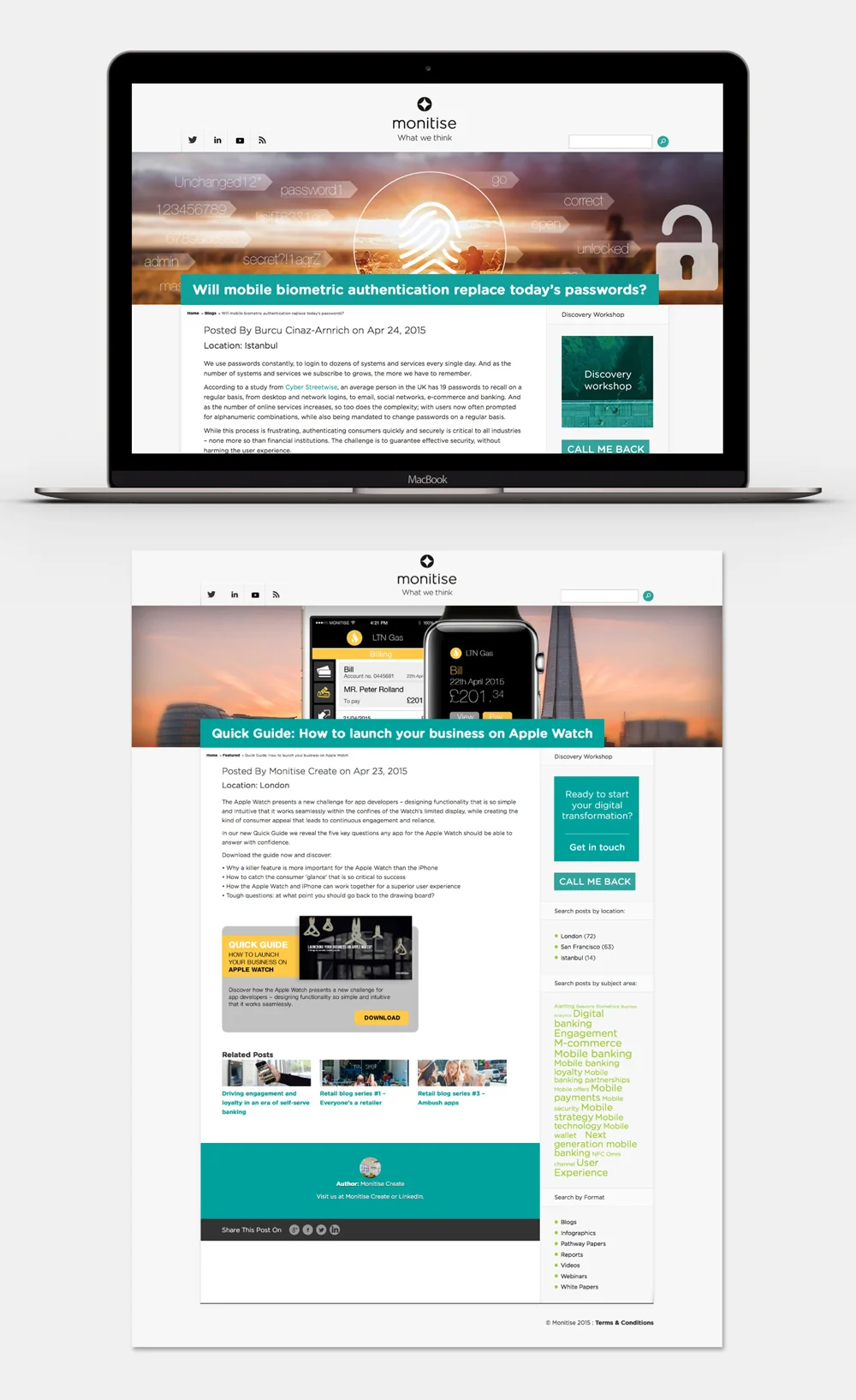
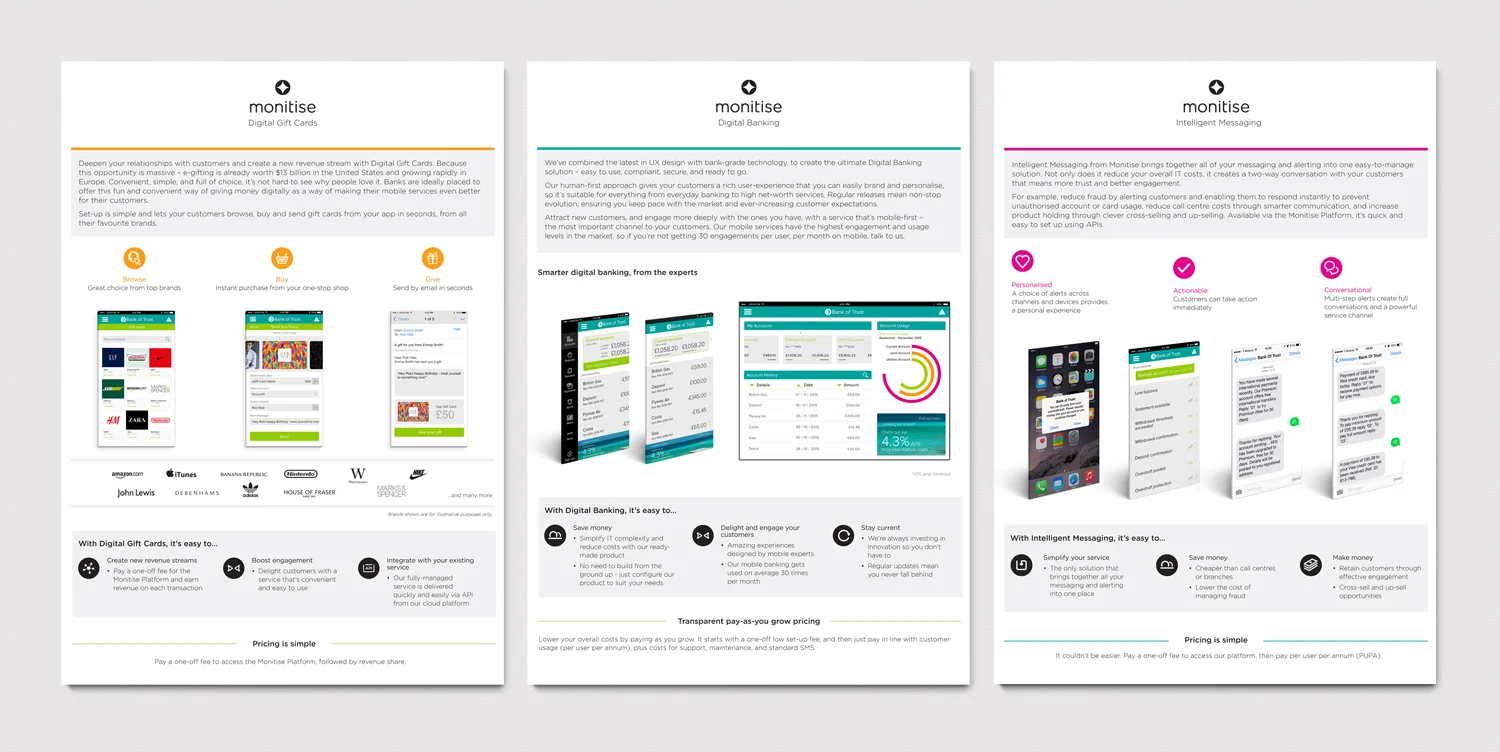
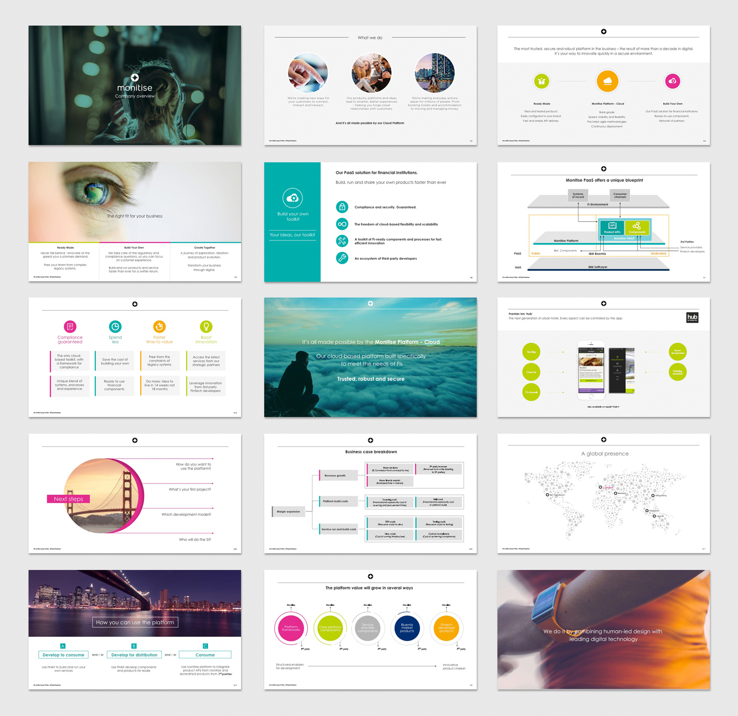
My responsibilities at Monitise included creating intuitive UX/UI for company clients, updating the company's Insights website with regular blog posts, creating global email campaigns and events (designing, formatting and HTML), designing marketing and product collateral from initial brief to execution such as presentation decks, factsheets, magazines, adverts, banners and supporting all the company's internal and external design needs.
One of the biggest tasks was the company rebrand. My role covered writing and creating new brand guidelines, new branded templates, conceptualising and producing an icon toolkit, designing sections and assets for the website and ensuring the project ran smoothly and consistently across all platforms.
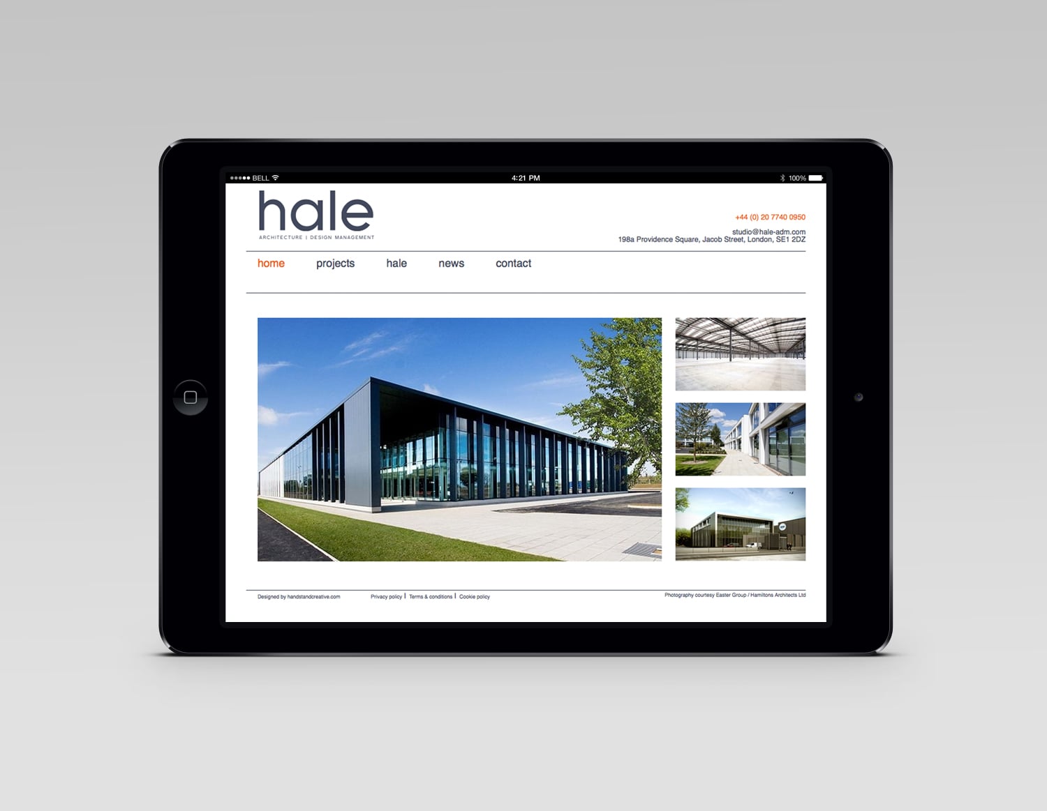
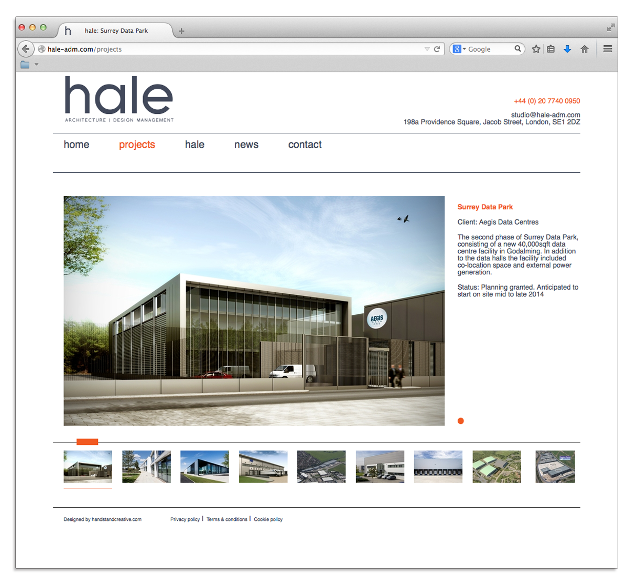
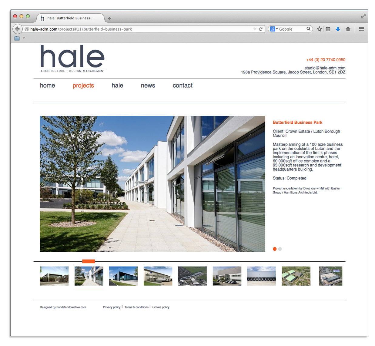
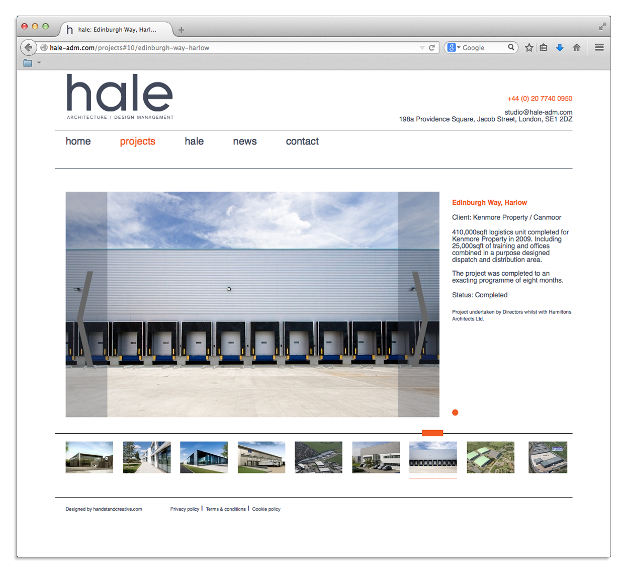
While working for Handstand Creative, I designed the website for Hale Architecture, a consultancy which specialises in commercial workspace.
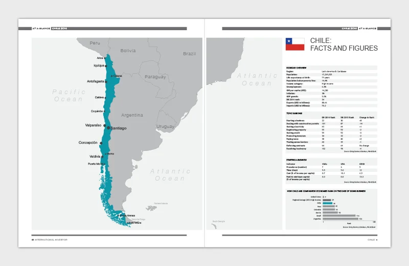
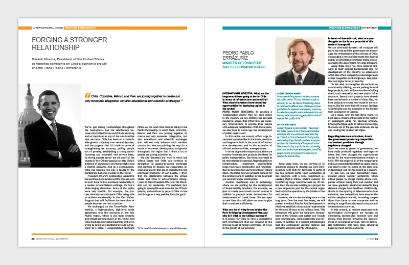
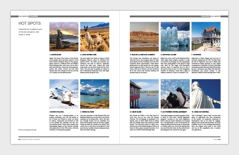
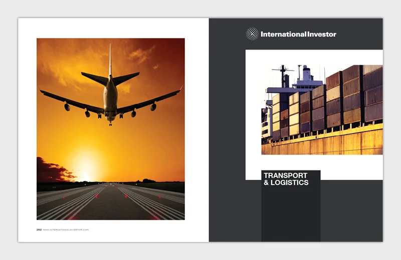
International Investor's publications cover all core sectors of the country’s economy and are an indispensable source of market intelligence.
I was responsible for the client's content-heavy publications, often collaborating across different time-zones with other designers, project coordinators and editors. Apart from the main publications I also produced banners for conferences, stationery, website assets and supported all the client's design needs.
While working for Handstand Creative, I was asked to produce a set of invitations for Investec's annual Garden Party. This was my 2nd year of creating bespoke hand drawn illustrations for the summer invites.
Creating icons is something I always enjoy. Here is a small selection from the different sets of icons I have produced from concept to final artwork.
A new icon toolkit following the company rebrand. Extensively used in all collateral, presentations and online.
Working with Puma icon guide to create small but clever icons that hide in corners, creases and under labels.
I introduced new branded icons to be used in print and online.
A set of icons for Future First, an alumni community, for their marketing brochure and online use.
Rebrand FFT, an anti-recording piracy initiative (part of Federation Against Copyright Theft). My tasks included creating a new visual style, designing a logo, producing a new set of style guidelines, Cinema Guide brochure update and a website refresh. Whilst at Handstand Creative.
Included full specifications guide.
New cover design and content refresh.
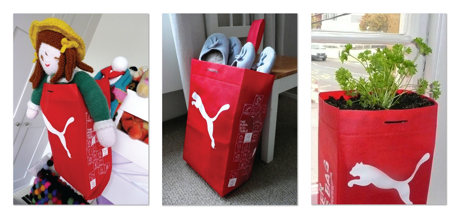
I was tasked with demonstrating a simple message creatively - to encourage customers to reuse the bag and inform them about the sustainable properties of the bag itself. Part of the Puma Awareness Programme project whilst working as an intern at GBH. The photography was included in the studio's Design Week Awards entry.
Worked with the Puma icon guide to create small but clever icons that hide in corners, creases and under labels - brainstorming, sketching, final artwork. Whilst at GBH.
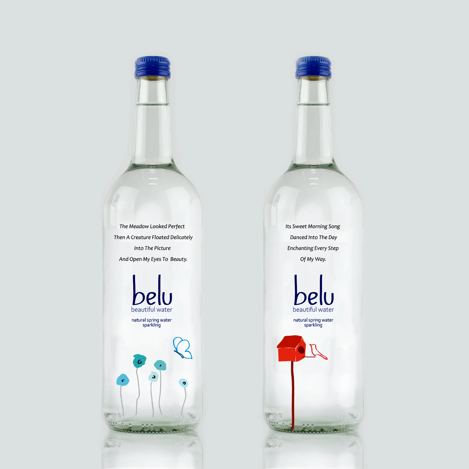
A design proposal for Belu, a bottled water company committed to sustainable development. The brief requirement was to rebrand Belu, highlighting its environmentally friendly efforts. Aimed at high-end bars, restaurant and hotels. Internship at Creative Orchestra.
Solution: As this bottled water would be sold for a premium price, with all the profits going to charity, Belu also gives something back, something beautiful to the consumer to thank them for giving - a pure product with heart-warming messages and illustrations to celebrate our beautiful planet.
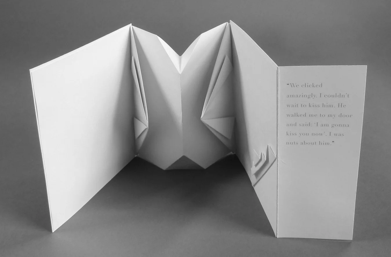
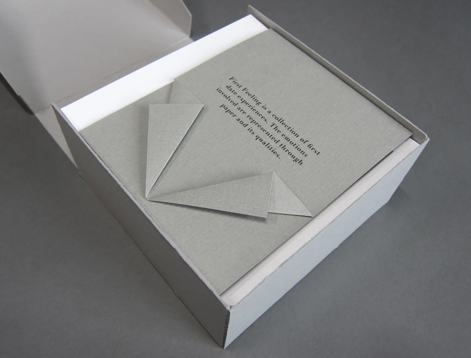
A collection of twelve first date experiences. I carefully extracted the essence of each date to include in the booklet. I used paper and its qualities with origami-inspired folds to express the emotions involved. This was my final major project and helped me graduate with Distinction.
An invite for six diverse artists exhibiting in Notting Hill, London. Working with only a small budget, the brief was to produce an invite that has its own artistic merit, reflects the artists' diversity and uses available resources. The final piece also functioned as a keepsake for the gallery visitors.